CALM & KIND FAMILY
Brand Strategy, Brand Identity, and Brand Messaging.
Brand Overview
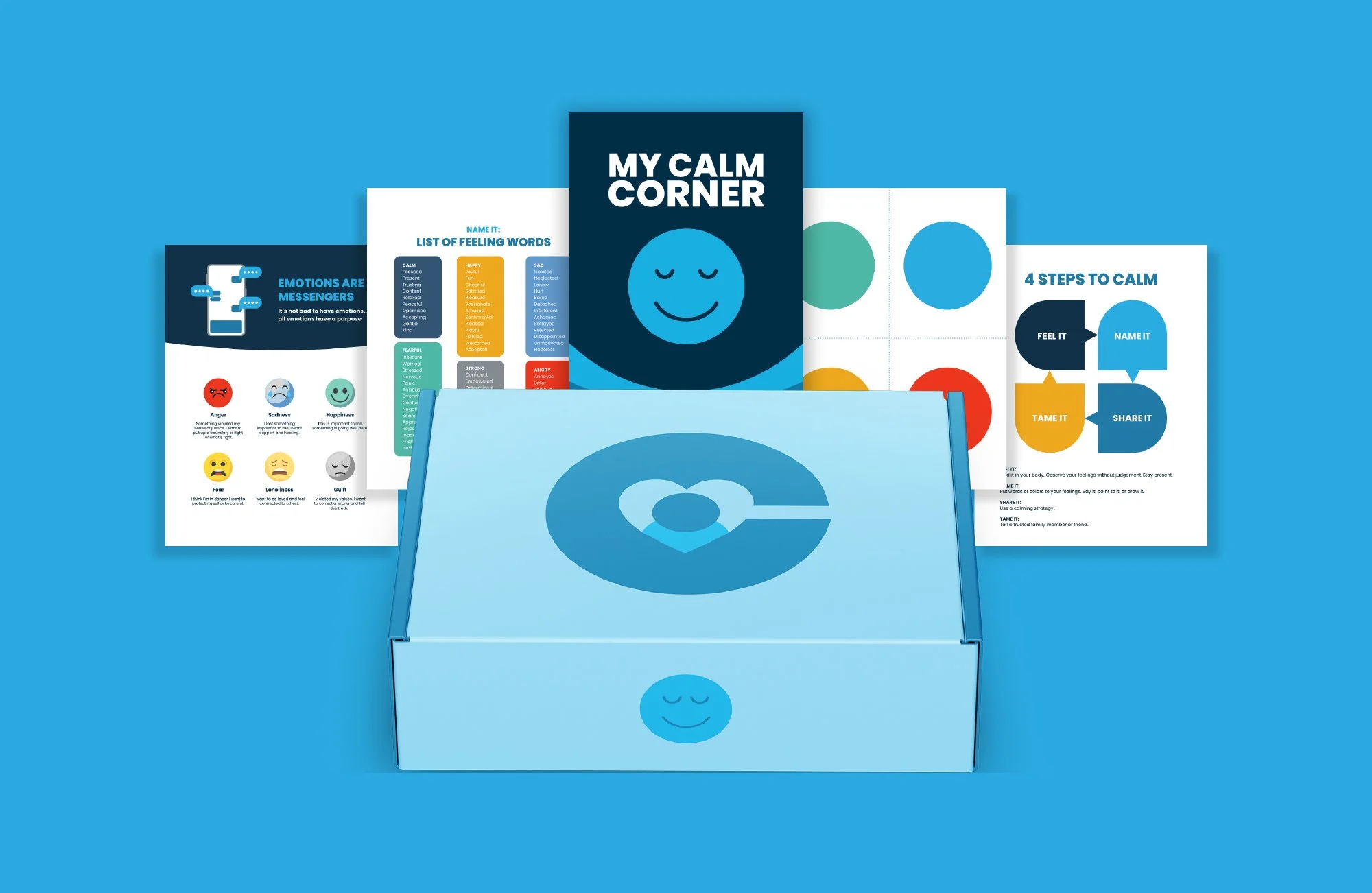
Calm & Kind Family is a family engagement program designed to help parents support their children’s emotional well-being with simple, practical tools they can use in everyday life.
Many family support programs feel overwhelming, overly clinical, or disconnected from what parents actually experience at home. This program was built to change that.
Instead of adding complexity, Calm & Kind Family focuses on clarity and application.
Through workshops, parents learn how to better understand mental health, support their child’s emotional regulation, and manage their own emotional responses so they can show up with more calm, confidence, and consistency.
The result is stronger parent-child relationships and more emotionally equipped families.
Objective
The objective was to create a brand that feels significantly more clear, approachable, and trustworthy than traditional family engagement resources.
Most existing programs in this space struggle with one of three things: they feel outdated, overly complicated, or difficult for families and school districts to engage with.
This created a barrier between the resource and the people it was meant to serve. The goal was to build a brand identity that removes that friction—something modern, easy to understand, and immediately trustworthy for both school districts and parents.
Our approach
We began by simplifying the message before designing the visual identity.
The core insight was that the challenge wasn’t a lack of content, but a lack of clarity. Parents didn’t need more information—they needed more usable information. From there, we defined the essential outcomes parents should walk away with and used those outcomes to shape both the messaging and the brand system.
Every design and communication decision was evaluated through a simple filter: does this make the program easier to understand and easier to trust?
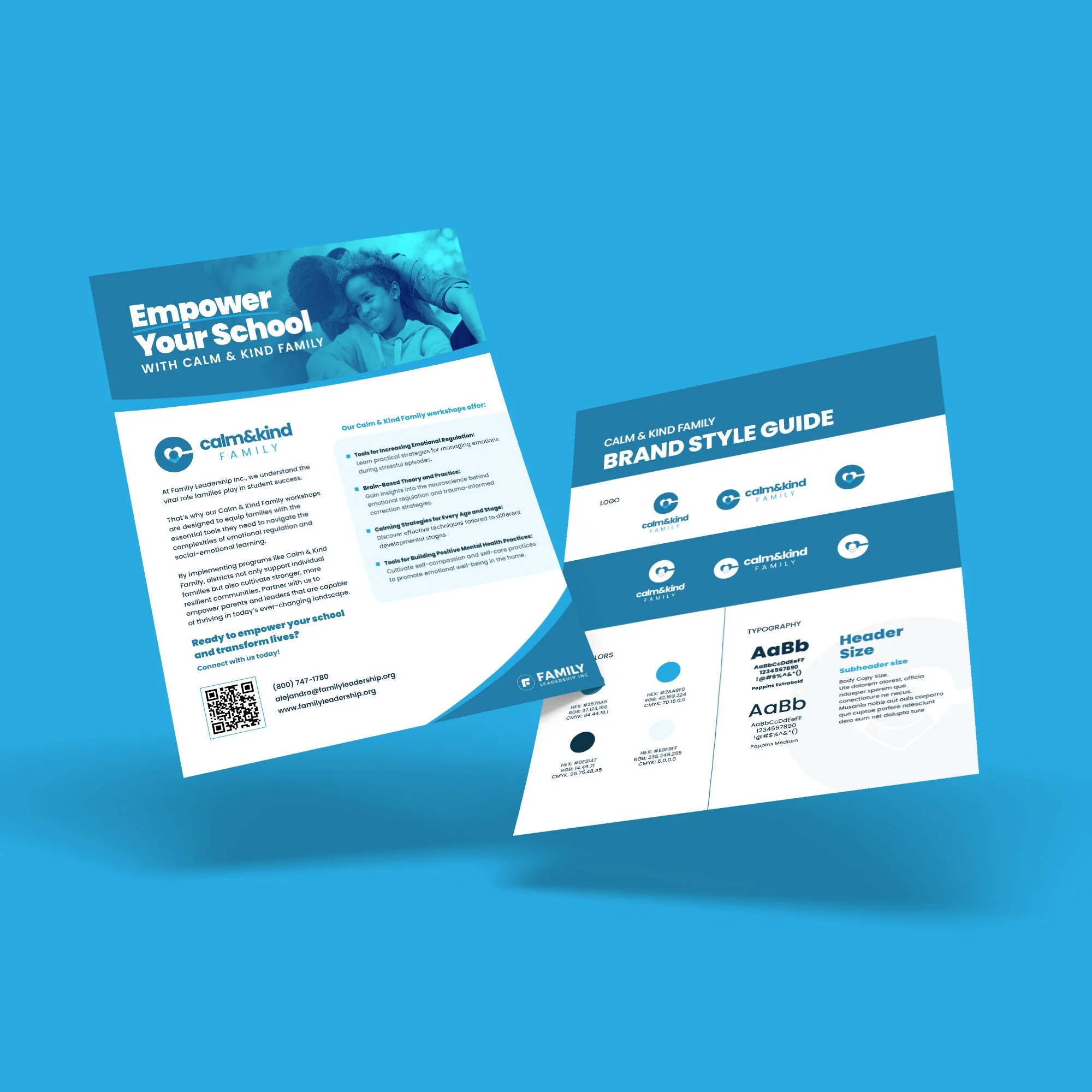
Visually, we used a calm blue color palette to communicate emotional steadiness, safety, and trust. Typography was selected to balance approachability with professionalism, ensuring the brand feels credible in school district environments while still feeling welcoming to families.
Together, the messaging and design system create a cohesive experience that feels calm, clear, and accessible from first impression to workshop participation.